Monday, July 16, 2007

Yet another project


Wow. There's just not enough time before the school year starts. My goal was to finish LearnIt, iPhone Cream, and the site for my dad's company... I finished the first version of iPhone Cream but there are plenty of things I still need to do with it like finish the iPhone version (no small task). I've been working on LearnIt; recently I got pretty excited about it because I finally narrowed down exactly what the first version will be. I have made progress of the design of my dad's website but I haven't even touched the coding.

Now... Yet another project. My mom had a great idea for a web app and I've got to get the first version done before summers out. Yikes. I can't tell you much about it but the target users probably aren't those reading this blog... Sorry guys. But that doesn't mean it's not going to be cool. I'll post more about it as I get further along. In the mean time I'll tease you with a screenshot of one of the first mockups of the interface.

If I'm going to get this stuff done I'm going to have to be extremely focused.

iPhone Cream merging with PhoneLauncher

PhoneLauncher recently announced that they were closing down. Shortly afterwards, they announced they were "not dead yet!" Why all this confusion? It is altogether related to iPhone Cream and by means of inference, me. The two sites are merging. Pretty soon phonelauncher.com will be forwarding to the iPhone Cream server but in exchange, the site will be called PhoneLauncher (I explain why below).

Why?
1. The guys behind PhoneLauncher are great; they will be able to add a lot of content to the new site and help with moderation as well. They will also help with marketing the site. All of these are things that I have been and will not be able to do. Why? I just don't have the time. I need to use my time to develop the site, create awesome iPhone apps (a iPhone version of the site is coming soon), and work on my other projects (about that in my next post).

2. iPhone Cream isn't going to work out. No not the site, the name. Check this out. Thats scary. I don't want to get chased by Apple's legal team. So the new name is PhoneLauncher.

See the post on PhoneLauncher about the merge.

Friday, July 13, 2007

LearnIt rejuvenated!


Finally, I have a clear vision of what is going into LearnIt 1.0. This focus has rejuvenated LearnIt. Sadly, LearnIt may not end up being the name of the project. I really like the name LearnIt but the 1.0 product will not be as focused on learning than I originally thought. When 1.0 comes out it will be a great tool in general (not just for learning). I will of course use it for learning and researching on the internet but it can be used in lots of different ways. That is why I would like to name it something more general and something more related to its main focus... Sorry, can't tell you yet. I'll talk about it more once I get closer to 1.0 (hopefully sometime before school starts).

One note: this thing is going to be awesome for the iPhone. I will be making an iPhone specific version as soon as I can finish the Safari/Firefox/IE version.

Bust a name: great tool


Bust a Name is a great new tool for finding domain names. Now-a-days (especially with web companies) finding a domain name may affect what you are going to call your company. Bust a Name works better than anything I have tried to date. It not only lets you instantly check if a domain name is available but it allows you to give it a list of words and it combines them and mixes and matches them. It also has lots of options like pluralize, suffix, and the choice wether to display .com, .net, or .org domain names only. Way to go guys.

Web Design From Scratch


Quick post to acknowledge a site I have been getting a lot of great web design insight from: Web Design From Scratch authored almost completely by Ben Hunt. He has spent a lot of time to create a really awesome free resource for web designers of all levels of skill. Some of the articles in there are a must read for aspiring web designers and a good reminder to seasoned web designers as well.

Ben Hunt's CMS from scratch looks pretty interesting too.

Simple, focused, and professional

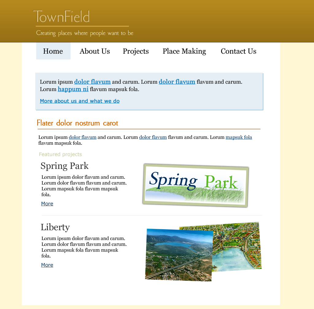
I have made quite a few website designs (for my personal consumption mainly) but never have I had to make a design that looks distinctly professional. So what do I do when I run into a client (my dad) who needs a website that will be seen by people he will be giving his business card to? How can I go from making cool, slick, fun websites to making a website that should just diffuse professionalism. One thing I'm not going to do is make it stuffy. I also want it to look pretty and be really easy to use. So here we go.

My first try shows just how hard this is going to be...


...There was just something that wasn't right. It looks nice but I don't think the visual message it conveys would be "professional". It also doesn't convey the "Creating places where people want to be" message very well.

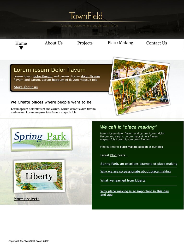
The latest version certainly isn't perfect but I think it is a great improvement...


I am actually quite happy with this version. I started from the ground up and I think it turned out pretty good. I am sure there will be another version but I think I'll be using this as the base for the final site. I think it also accomplishes a goal that I have for the home page of almost every brochure site I make: make the home page a portal to the other parts of the site. Focus on the three or less main things that the site is about giving people a taste of each section. This allows users to easily find exactly where they want to go.

What do you think?

Thursday, July 12, 2007

Digg and iPhone filtering interfaces

One of the first iPhone applications was a Digg interface developed by David Cann. I really enjoyed using the app. Yesterday Digg released an official iPhone version of Digg. The two versions of Digg on the iPhone give opportunity to discuss an iPhone specific design decision.


When you open up David Cann's version of Digg (we'll call it "Canned Digg") you are presented a list of the Digg topics. Press a topic to see all the latest and greatest stories under that topic. The official Digg (we'll call it DIGG) uses a different approach. When you open up DIGG you are presented a list of the stories from all topics. But on the top there is a header that allows you to either log in (to Digg stories) or choose a specific topic.

What approach is best for the iPhone? This is something I've had to think about making my iPhone apps. Is it better to show users the topics and then drill down until you get to the content (much like the typical iPod interface) or is it better to show the general content and let the user narrow down from there. At this point I am in favor of the latter approach. Especially over a slow EDGE connection, users are going to want value on the first page of the site. With only one filter though, I think both versions work pretty well. But the DIGG approach begins to make a lot more sense when you have more than one kind of filter. Say Digg decided to allow users to filter based on their top level sections (News, Videos, and Podcasts), their topics, their sub-topics, and their "Popular Stories" and "Upcoming" sections. That would be a lot of screens to go through before getting to valuable content. Using the Canned Digg approach to such a problem would not only be slower but it would be frustrating for the user because the user is forced to filter to a certain level that he may not want to filter to. For example, say a user wanted to look at the latest podcasts; using a Canned Digg approach he would have to go to podcasts->topic:all->popular stories. The user may not even know what the difference between "popular stories" and "upcoming stories" is but he would have to make a choice any way. This could be frustrating. This approach makes users think. We, as developers, do not want to make users think. They are not "thinkers", they are "users. All they should need to do is "use".

The downside to using the DIGG approach is that if one was to be looking for something very specific, it would take longer than the Canned Digg approach because he would have to first open the "filters", press the first filter, select the item, press the next filter, press the item, etc.

I would love to hear other peoples thoughts on these two approaches to iPhone filtering interfaces