Simple, focused, and professional
I have made quite a few website designs (for my personal consumption mainly) but never have I had to make a design that looks distinctly professional. So what do I do when I run into a client (my dad) who needs a website that will be seen by people he will be giving his business card to? How can I go from making cool, slick, fun websites to making a website that should just diffuse professionalism. One thing I'm not going to do is make it stuffy. I also want it to look pretty and be really easy to use. So here we go.
My first try shows just how hard this is going to be...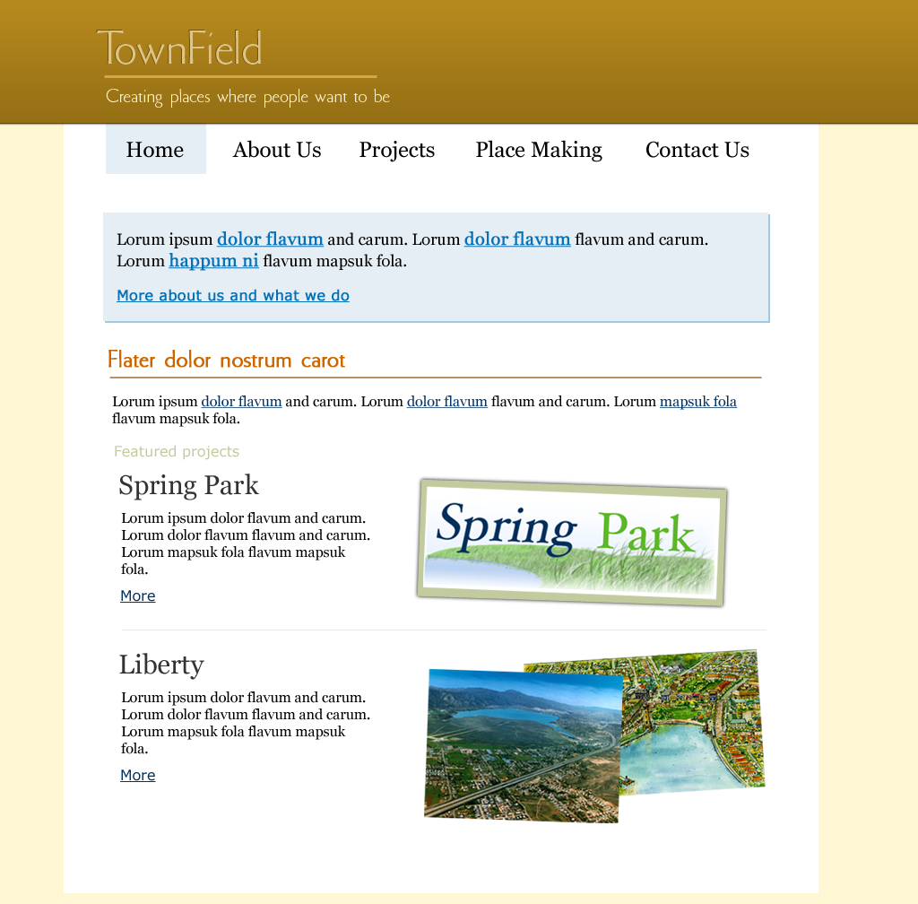
...There was just something that wasn't right. It looks nice but I don't think the visual message it conveys would be "professional". It also doesn't convey the "Creating places where people want to be" message very well.
The latest version certainly isn't perfect but I think it is a great improvement...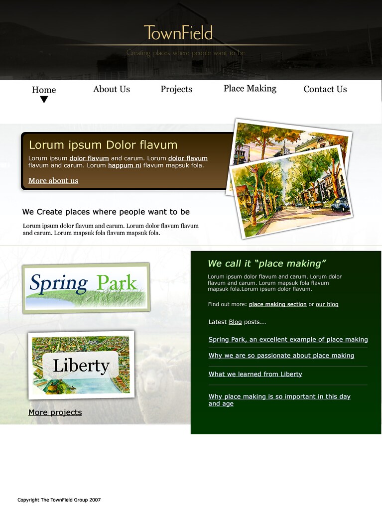
I am actually quite happy with this version. I started from the ground up and I think it turned out pretty good. I am sure there will be another version but I think I'll be using this as the base for the final site. I think it also accomplishes a goal that I have for the home page of almost every brochure site I make: make the home page a portal to the other parts of the site. Focus on the three or less main things that the site is about giving people a taste of each section. This allows users to easily find exactly where they want to go.
What do you think?
![]()
 Thoughts, developments, and updates